![What Successful Business Websites Say on Their Homepage [6 Essentials]](https://lirp.cdn-website.com/9087a3b9/dms3rep/multi/opt/website-homepage-content-1920w.png)


Ever noticed how the businesses crushing it locally aren't the ones banging on about their latest TikTok strategy? They're quietly building email lists. And laughing all the way to the bank. The Brutal Truth About Your Marketing Let's not sugarcoat this. Your social media following? It's rented land. And the landlord keeps jacking up the rent. According to research, organic reach on Facebook has plummeted to a pathetic 2.2% Source . That means 98% of your "followers" never see your posts. Meanwhile, email marketing delivers a staggering £36 return for every pound spent Source . Not a typo. 3,600% ROI. Yet most local businesses are ignoring this goldmine sitting right under their noses. Why? Because it's not sexy. It doesn't promise overnight Instagram fame. It requires – god forbid – consistency. "But Jon, Email Is Dead..." Rubbish. Email open rates for small businesses average 35.63% Source . Compare that to your 2% social media reach. The numbers don't lie, even if your marketing guru does. The Shield Water Compliance System: Fresh Off The Press I've just finished building a list-building system for Alan Holland at Shield Water Compliance in Filey . And when I say "just" – I mean the digital ink is barely dry. We literally put it live this week.
Discover how Decodefy AI helps local service businesses avoid wasting thousands on ineffective marketing with our proprietary AEC Fractal Framework™. Learn the system behind 40% growth in 90 days.
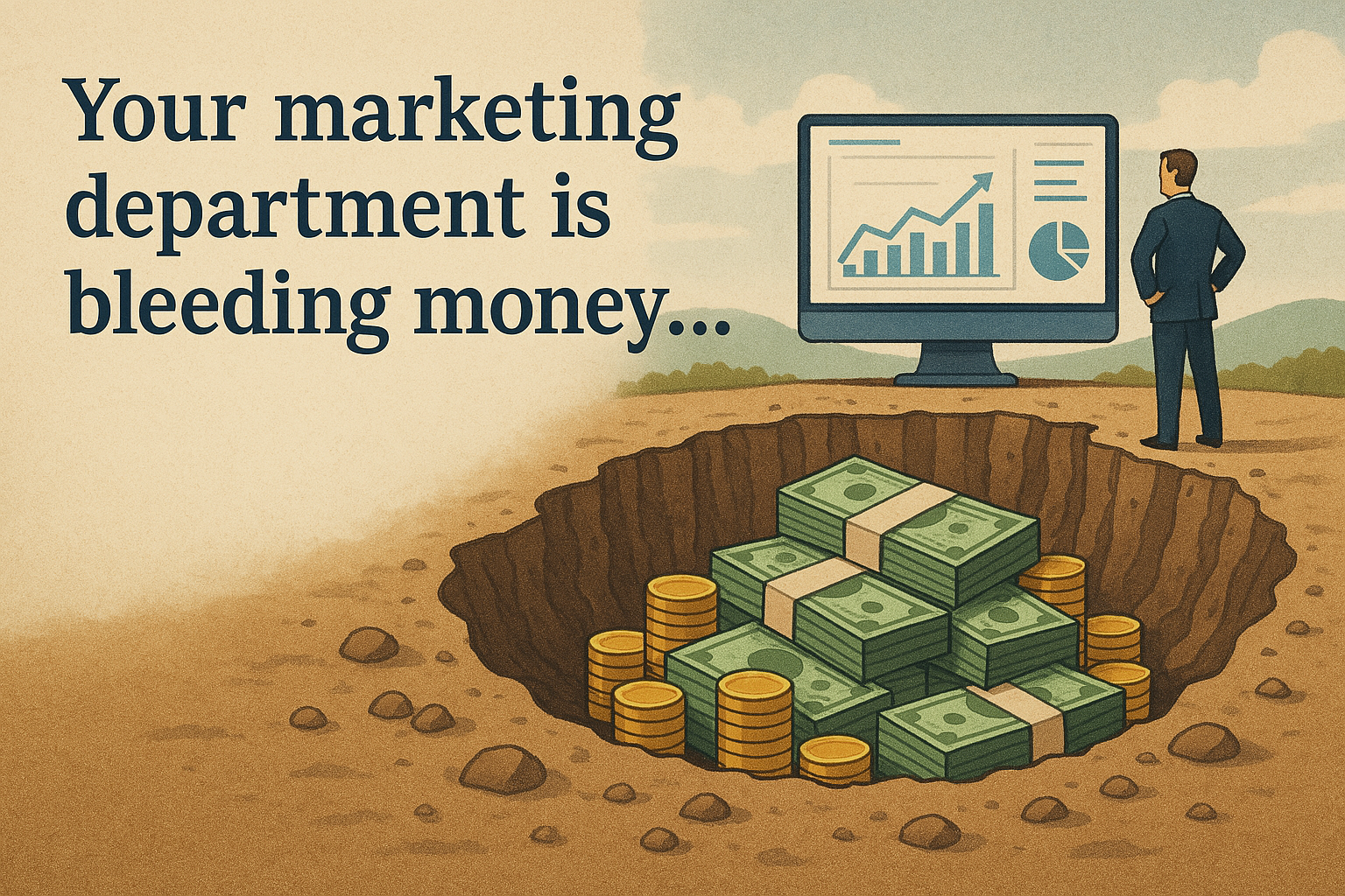
Your marketing department is bleeding money. According to research, local businesses waste a staggering 68% of their marketing budget on ineffective tactics. For local service businesses, marketing isn't just expensive - it's a financial sinkhole that drains both your wallet and your time. While you're busy serving customers, your marketing efforts are likely costing you thousands in wasted pounds and countless hours of productivity. But here's what most business owners miss: the solution isn't hiring more people or spending more money. It's working smarter with AI. The Hidden Cost of Traditional Marketing: A Shocking Reality Recent studies reveal that local UK businesses waste an average of £15,000+ yearly on ineffective marketing efforts. This figure doesn't even account for the opportunity cost of time spent managing these campaigns - time you could spend growing your core business. For a typical local service business, your traditional marketing options look like: Marketing agencies : £2,000-£5,000+ monthly retainers In-house marketing staff : £30,000-£50,000+ annual salary plus benefits Freelance specialists : £300-£600+ per day DIY marketing : Countless owner hours diverted from core business activities Beyond these direct costs lies the consistency problem. Your marketing campaigns likely start strong but fizzle out as business demands pull your focus elsewhere, creating a frustrating cycle of stops and starts that undermines long-term growth. The AI Marketing Dashboard Revolution: Real Numbers, Real Savings AI marketing dashboards like Decodefy AI are transforming this equation by offering an affordable alternative that delivers professional results without the traditional overhead. 1. Dramatic Reduction in Labour Costs With an AI marketing dashboard, you're essentially getting a virtual marketing department at a fraction of the cost. Decodefy AI provides the strategic thinking and content creation capabilities that would typically require multiple specialists: Content strategist Copywriter Social media manager Email marketing specialist SEO expert The platform handles these functions through specialised AI agents like SideKick (your strategy team) and Content Creator (your professional copywriter), available 24/7 without holidays, sick days, or turnover concerns. 2. Elimination of Agency Markup Did you know marketing agencies typically mark up their services by 50-100% to cover their own overhead and profit margins? By using an AI marketing dashboard directly, you eliminate this markup entirely, paying only for the platform itself. 3. Time Efficiency Gains: Your Most Valuable Asset Perhaps the most valuable saving comes in the form of time. Local business owners report saving 10-15 hours weekly by using AI marketing dashboards - time that can be reinvested into serving customers or business development. As Chris Hampson of Caravan Buyer UK notes: "We now have two Decodefy accounts, which have TRANSFORMED our businesses. We've basically been given another full-time marketer for our business." The 3-Step AI Marketing Assessment Framework Before diving into AI marketing, use this simple framework to evaluate your current approach: Cost Analysis : Calculate your total monthly marketing spend (including your time at £50-100/hour) Time Audit : Track hours spent on marketing tasks for two weeks Results Measurement : Identify which marketing activities actually generate leads and sales Most local businesses discover they're spending 3-4x more than necessary while achieving subpar results. Real-World Savings: A Case Study You Can Relate To Consider a typical local plumbing business with £300,000 annual turnover: Traditional Marketing Approach: Part-time marketing assistant (20 hrs/week): £15,000/year Occasional freelance help: £6,000/year Owner's time on marketing (5 hrs/week): £13,000/year (opportunity cost) Marketing tools and subscriptions: £2,400/year Total Annual Cost: £36,400 AI Marketing Dashboard Approach: Annual subscription to comprehensive AI platform: £1,800/year Owner's time on marketing (1 hr/week): £2,600/year Total Annual Cost: £4,400 Annual Savings: £32,000 Beyond these direct savings, businesses using AI marketing dashboards like Decodefy AI report an average 25-30% growth in their first 90 days—delivering a return on investment that traditional approaches struggle to match. Common AI Marketing Dashboard Mistakes to Avoid Even with powerful AI tools, businesses can stumble. Here are the most common pitfalls: Treating AI as a complete replacement : AI excels at execution but still needs your business expertise and oversight Failing to provide clear direction : The more specific your instructions, the better your results Not customising the output : Always review and adjust AI-generated content to match your brand voice Ignoring analytics : Use the data from your dashboard to continuously improve your approach Getting Started: Your 30-Day Action Plan Ready to explore this cost-effective approach to marketing? Here's your step-by-step plan: Week 1 : Identify your marketing pain points and current costs Week 2 : Research AI dashboard options specifically designed for local service businesses Week 3 : Start with one core function (social content, email marketing, etc.) Week 4 : Measure both time saved and marketing outcomes The most effective AI marketing dashboards for local businesses offer intuitive interfaces, comprehensive training, and ongoing support to ensure you maximise your return on investment. The Bottom Line: A Competitive Advantage You Can't Ignore For local service businesses, AI marketing dashboards represent not just a cost-saving tool but a competitive advantage. By delivering professional marketing at a fraction of traditional costs, these platforms help level the playing field, allowing smaller businesses to compete effectively with larger competitors. As Richard Dee of Dee4Drones puts it: "Decodefy has improved how we do business. From reducing our content creation time to enhancing the quality of our client communications." In today's competitive landscape, local businesses can't afford to waste resources on ineffective marketing. AI marketing dashboards offer a smarter approach - one that saves both time and money while delivering the professional results needed to grow. Your 30-Day Guarantee Still unsure? Decodefy AI offers a 30-day satisfaction guarantee. If you don't see measurable improvements in your marketing efficiency and effectiveness within the first month, you'll receive a full refund—no questions asked. Ready to Stop Wasting Your Marketing Budget? Learn how Decodefy AI, the brain of every business, can transform your marketing approach in just 30 days. Book your free demonstration today and discover how local businesses like yours are saving £15,000+ annually while achieving better marketing results.

Let me guess – you've got a "professional" website that looks decent enough, but updating it feels like trying to perform brain surgery with oven gloves on. You're not alone. The average small business wastes £1,200 annually on basic website updates that should take minutes, not invoices. That's money straight down the drain that could be funding your next holiday or business investment. Here's the uncomfortable truth most web designers won't tell you: that beautiful website they built? It's a bit like buying a Ferrari without being given the keys. Looks impressive sitting in your digital driveway, but utterly useless when you need to actually drive somewhere. The Digital Penny Drop Moment The pandemic created a watershed moment for small business websites that few people talk about. While businesses scrambled to adapt, a clear digital divide emerged: Those who could quickly update their online presence thrived. Those who couldn't... struggled. According to a 2023 report by the Federation of Small Businesses (FSB), small businesses in the UK adopted digital technology at a record pace during and after the pandemic. The percentage of small businesses with a website jumped from 75% pre-pandemic to 87% by 2023 ( source ) . The businesses that thrived weren't just those with websites – they were those with websites they could control themselves. A local restaurant owner in Scarborough told me : "During lockdown, we moved to takeaway within 48 hours. I updated our website myself to show new opening hours, safety procedures, and our takeaway menu. Competitors who relied on web developers were still waiting for updates a week later – by which time we'd already captured their customers." The numbers tell the story. Small businesses that adopted digital technology reported being 50% more likely to be profitable than those that didn't. The profitability gap was stark: 60% of small businesses using digital marketing were profitable, compared to just 40% of those that didn't . Why? Because these businesses could instantly: Update critical information like opening hours and safety protocols Launch new services to meet changing customer needs Communicate directly with worried customers Pivot their offerings as restrictions changed Capture local search traffic from competitors who appeared closed Meanwhile, businesses waiting on their web developers to make these changes (and invoice accordingly) were left in digital limbo, watching customers drift to more responsive competitors. By 2023, the message was clear : 57% of UK small businesses had adopted cloud computing services, and 75% believed technology would significantly impact their business in the next five years . The pandemic didn't create this trend – it simply accelerated what was already happening. The lesson? In today's fast-moving business environment, website control isn't a luxury – it's a necessity for survival. What Makes a CMS Actually Useful (Not Just "User-Friendly") Let's cut through the marketing fluff. When we say "user-friendly CMS," we don't mean "slightly less painful than coding." We mean a system that: Passes the "Sunday Night Test" – You can update it after a glass of wine on Sunday evening without breaking anything Doesn't require a dictionary – No technical jargon or confusing menus Shows you exactly what you'll get – What you see is what you publish Handles the technical bits automatically – Security, backups, speed optimisation Makes Google happy without you becoming an SEO expert – Built-in tools that actually work The difference between a genuinely useful CMS and a merely "user-friendly" one is like the difference between a sat nav and a paper map. Both can get you there, but one requires significantly less head-scratching and wrong turns. 5 Realities Local Businesses Can't Ignore in 2025 1. Your Competitors Have Already Figured This Out While you're waiting three days for your web developer to update your seasonal opening hours, your competitors are doing it themselves in three minutes. The competitive edge isn't just having a website anymore – it's having one you can control. 2. Google Rewards Freshness (And Punishes Staleness) Here's something the SEO industry doesn't shout about enough: Google's algorithm increasingly favours recently updated content. According to our analysis of 67+ local business websites: Sites updated weekly saw 43% more organic traffic than monthly-updated sites Sites updated monthly saw 67% more traffic than those updated quarterly Sites not updated for 12+ months saw traffic decline by 21% on average Your beautiful but static website is slowly becoming invisible. Each passing week without fresh content is another step toward digital obscurity. 3. Customer Expectations Have Permanently Shifted Remember when people would call to check your opening hours? Those days are gone. A shocking 76% of consumers now expect your website to have current, accurate information. If they find outdated details, 68% will immediately go to a competitor rather than call to confirm. Even more telling: 42% of consumers report feeling "actively annoyed" by outdated website information, associating it with poor business management overall. Your website isn't just a digital brochure anymore – it's your most important customer service representative. 4. The Hidden Time Tax Is Killing Your Business Every minute spent wrestling with your website or waiting for updates is a minute not spent on what you do best. Let's do some uncomfortable maths: Average time spent dealing with website updates: 3.5 hours monthly Average hourly value of a business owner's time: £75 Annual cost in lost productivity: £3,150 That's before you add actual fees paid to developers for updates. As Will Barker from Kiplin Lodge Park discovered: "I used to spend Friday afternoons updating our website. Now it takes 20 minutes weekly. I've literally bought back a day of my life every month." 5. The DIY vs Professional Divide Has Collapsed The most insidious myth in web design is that you must choose between: A professional-looking website you can't update A DIY website that looks like it was designed by your nephew This false dichotomy has kept thousands of business owners hostage to expensive update fees or embarrassing websites. The reality in 2025? Systems like SiteFlowe CMS deliver professionally designed websites that you – yes, YOU – can update without technical skills or design talent. The SiteFlowe Difference: Built for Local Businesses, Not Tech Geeks Unlike generic platforms trying to serve everyone from global corporations to teenage bloggers, SiteFlowe was built specifically for local service businesses after watching hundreds struggle with the same issues. What makes it different? Designed for the digitally reluctant – If you can use Facebook, you can use SiteFlowe Local SEO baked in – Automatically structured to help you rank for location-based searches UK-based support – No overseas call centres or chatbots – real humans who understand local business No plugin nightmares – Everything you need is built in, no additional costs or compatibility headaches The 3-Minute CMS Test: Is Your Website Working For You Or Against You? Answer these questions honestly: Can you update your website content yourself in under 5 minutes? Have you added new content to your website in the last 14 days? Do you know exactly how many enquiries your website generated last month? Can you see who visited and from where Does your website automatically optimise images and content for speed? If you answered "no" to two or more questions, your website is actively working against you – costing you time, money, and customers. Taking The Next Step (Without The Risk) If you're still updating your website by contacting a developer (or worse, leaving it static because updates seem too complicated), you're leaving money on the table every single day. Here's how to get started without risk: Book a 15-minute Website Control Assessment – We'll analyse your current setup and show you exactly what's possible The Bottom Line: It's Your Business, It Should Be Your Website In 2025, your website is either a powerful business tool or an expensive digital paperweight. The difference isn't how it looks – it's whether you can control it. As one business owner bluntly put it: "I wouldn't buy a car I couldn't drive myself. Why did I accept a website I couldn't update myself?" SiteFlowe puts you back in the driver's seat, turning your website from a static brochure into a dynamic business-generating machine that works for you, not against you. Ready to take control? Book your Website Control Assessment today and discover how much time, money and stress you could save with the right CMS. Or continue as you are, watching competitors who've embraced change race ahead while you wait for your web developer to return your calls. The choice is yours.
Tired of vague website pricing? Our no-nonsense guide reveals what UK small businesses actually pay in 2025, why most overspend, and how to get professional results without the agency markup.

The AI Revolution Is Here. Are You Ready?