Top Benefits of Responsive Web Design for Your Business
Top Benefits of Responsive Web Design for Small Businesses
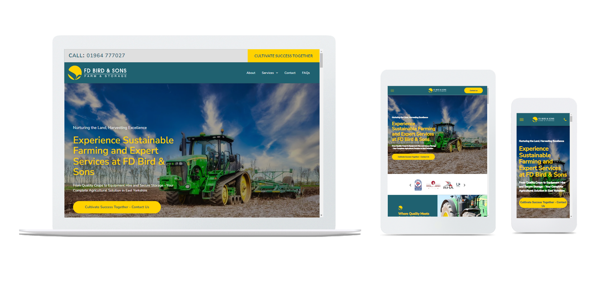
In an increasingly mobile world, having a responsive web design is no longer a luxury; it is an absolute necessity for small businesses aiming to remain competitive. A responsive web design adjusts seamlessly across devices - be it a desktop, tablet, or smartphone - providing users with an optimal viewing experience.
Here’s why responsive web design should be at the forefront of your digital strategy.
1. Improved User Experience
User experience (UX) is critical in determining whether a visitor will stay on your site or bounce away. A responsive design ensures that your website functions well on any device, providing users with easy navigation, fast loading times, and a visually pleasing layout. When users find your website easy to use, they are more likely to engage with your content and ultimately convert into customers.
2. Increased Mobile Traffic
With over half of all web traffic coming from mobile devices, not having a responsive design means you could be missing out on a significant portion of your audience. A site designed to work across all devices makes it easy for potential customers to access your content on the go. This is particularly important for local service businesses that rely on customers searching for services in real-time.
3. Better SEO Performance
Search engines like Google prioritise mobile-responsive websites in their rankings. By using a responsive design, you can improve your SEO performance and climb higher in search results. A single, responsive website eliminates the need for separate mobile and desktop versions, which can dilute your SEO efforts. This means enhancing your visibility to potential customers searching for services in your area.
4. Cost-Effective Solution
Investing in a responsive web design can be more cost-effective in the long run compared to maintaining separate websites for desktop and mobile. Although the initial investment may be higher, you'll save on costs associated with duplicate content, SEO efforts, and overall maintenance. Additionally, a responsive design reduces the need for ongoing edits and updates, streamlining your management efforts.
5. Future-Proofing Your Business
Technology continues to advance rapidly, and so do user preferences. A responsive web design ensures that your website is adaptable to new devices and resolutions that emerge over time. By staying ahead of the curve, you can provide a consistent user experience, regardless of how the technology landscape changes.
6. Enhanced Analytics and Insights
With a responsive site, you’ll have a single set of analytics that provides a clear picture of how users are interacting with your content across devices. This consolidated data means you can analyse user behaviour more effectively and adapt your strategies for growth based on reliable insights.
Remember...
Responsive web design is a critical component of a successful digital strategy for small businesses. By focusing on improving user experience, increasing mobile traffic, enhancing SEO performance, and saving on long-term costs, a responsive design ensures that your website remains competitive. It is a necessary investment that prepares your business for the future and provides a seamless experience for all users.
To learn more about how good design can shape your online reputation, visit our page on Boosting Your Online Reputation Through Effective Web Design.
For more details about our services, visit our main page Discover our tailored web design offerings.
FloweMedia Yorkshire: 11 Chapel Lane, Scarborough, North Yorkshire, YO11 3SW
FloweMedia Suffolk: 125 High Road East Felixstowe Suffolk, IP11 9PS